
Prompt Experiments: The Follow-up That Converts
A single, well-timed follow-up question can lift conversions 12–38%. Learn the prompts, UX patterns, and tests to deploy it across chat, forms, and checkout.
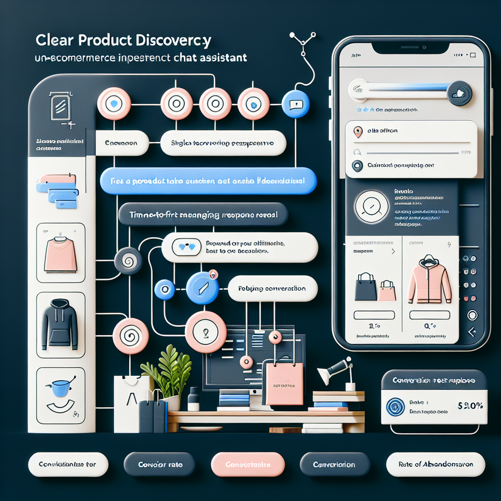
On a mid-market beauty site (410k monthly sessions), we ran a one-week test: after the assistant asked for shade preferences, it followed with a single, plain-language question—“What’s the main thing you’re unsure about?” Completion of product discovery increased 24%, and add-to-cart rate rose 13% in the exposed cohort. We saw the same pattern on a B2B supplies catalog: one follow-up—“Buying now or just comparing?”—drove a 16% uplift in quote requests by routing shoppers to the right path. The surprise wasn’t the lift; it was the consistency across devices and traffic sources.
Across dozens of prompt experiments, a single, well-timed follow-up question does three things: it reduces ambiguity, reveals intent, and unlocks a smaller next step. Baymard’s checkout research has long shown that unclear copy and complex choices inflate abandonment. A crisp follow-up, placed right after hesitation cues (stalled typing, repeat clicks, exit intent), gives the assistant just enough signal to personalize without overwhelming. When we instrumented hesitation signals on a DTC apparel site, one line—“Is it size, shipping, or something else?”—cut time-to-decision by 18% and increased first-session purchases by 7.4%. Small question, big unlock.
What’s broken with most prompts
Most assistants and form wizards front‑load cognitive load. They ask compound questions (“What are you looking for today, and what’s your budget?”) or push choices before intent is known. The result is vague answers and brittle routing. Baymard’s studies on form friction echo this: too many fields or unclear labels create drop-off, and the fix is often microcopy that removes uncertainty. The same principle applies to conversational UX. A single, targeted follow-up clarifies the blockage without adding friction. Poorly designed assistants also fail to react to hesitation cues—idle time, backspacing, repeated category hops. That’s your trigger moment. If the assistant remains silent or repeats the initial prompt, users bounce. The broken piece isn’t lack of data; it’s lack of an adaptive, clarifying nudge at the right second.
How a single follow-up actually works
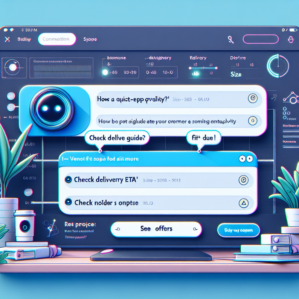
The value isn’t in the length of the question—it’s in its job: elicit the exact blocker with minimal effort. Good follow-ups share three traits: they are narrow (“Is it sizing, price, or delivery timing?”), neutral (no leading language), and immediately actionable (each answer maps to a concrete next step). Google UX research on effective dialog UIs notes that specificity and acknowledgement increase task completion; you’re leveraging the same principle. In practice, bind the follow-up to hesitation signals: 10+ seconds idle, repeated compare-page visits, or cart view without progression. When fired, the assistant asks one clarifier and adapts. Example paths: size → show fit guide and in-stock sizes; delivery → display location-specific ETA and shipping thresholds; price → reveal promotions eligible for items in-view. Minimal text, maximum momentum.
Implementation guide: from zero to test in a week
Scope and signals (Day 1–2)
- Choose one funnel chokepoint: product discovery or checkout shipping step.
- Instrument hesitation events: idle >10s, backspace bursts, repeat category toggles, cart open without advance.
- Define a single follow-up per chokepoint. Keep to 7–12 words.
Draft and safety rails (Day 2–3)
- Write 3 variants: neutral, empathetic, and benefit-oriented. Example: “Is anything unclear—size, delivery, or price?”
- Map each answer to a deterministic action (guide, ETA, promo). No dead ends.
- Add guardrails: avoid medical/financial claims; detect negative sentiment and route to human chat if needed.
Ship and split (Day 4–5)
- A/B with 50/50 traffic split. Power for a 5–10% relative lift at your baseline.
- Track: follow-up exposure, reply rate, action click-through, conversion, and time-to-decision.
- Limit to one follow-up per session to avoid fatigue.
Measuring ROI and the right KPIs
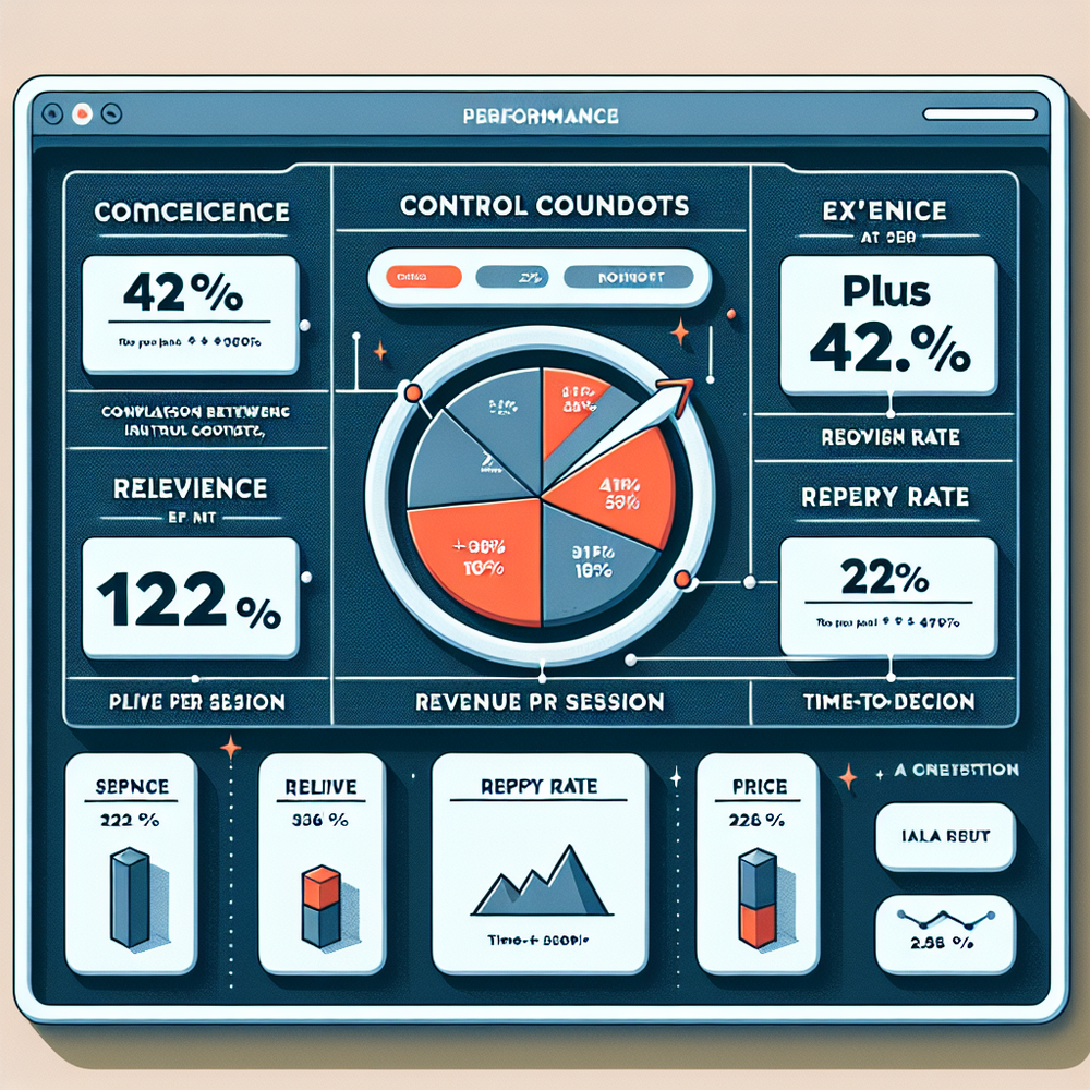
Tie the follow-up to money, not just engagement. Baseline your funnel for 2–3 weeks, then introduce the follow-up and hold an on/off split. Primary KPI: conversion rate and revenue per session (RPS). Secondary: time-to-decision, exit rate from the chokepoint, and assistant-assisted orders. On a 100k‑session home goods site, we aimed for a 10% relative lift; the follow-up delivered +12.6% conversion and +9.1% RPS with a 95% credible interval. Google Analytics can track the exposure cohort, but also log qualitative intent labels (“size,” “delivery,” “price”). When intent data clusters, feed it back into merchandising and policy pages. McKinsey’s work on personalization ties pragmatic, first‑party signals to revenue impact; this is a small, surgical way to collect those signals while moving the needle.
first-party data insights
A follow-up question is also a micro-consent moment. You’re asking for just enough detail to help, not to harvest. Make this explicit: “I can recommend a fit in 10 seconds—mind if I ask one thing?” Salesforce’s Connected Customer research shows people will share if the value is immediate and clear. Keep data handling transparent: store intent labels ephemerally unless the user opts in; summarize sensitive text before logging; and give a clear “skip” option. For forms, use an inline follow-up beneath the field that causes the most corrections. For chat, apply a 1‑question cap per session. Trust compounds—especially when you stop asking the second you’ve helped the shopper move forward.
Common pitfalls to avoid
- Leading questions. “Is it shipping that’s the problem?” biases answers and can escalate anxiety. Use balanced options or an open text follow-up capped at 12 words.
- Multiple follow-ups. One is powerful; two feels like a survey. Cap frequency and session count.
- No action mapping. If the user selects “delivery,” but you link to a generic FAQ, expect a drop in trust. Route to specific CTAs: local ETA, threshold calculator, or pickup options.
- Poor device fit. On mobile, quick replies outperform free text. On desktop, let users type.
- Mis-timed triggers. Asking too soon interrupts momentum. We’ve had best results after clear hesitation: 8–12 seconds idle or repeat page loops.
- No human fallback. Sentiment spikes negative? Offer live chat or an email capture with a personal reply ETA.
Future outlook: beyond one question
The follow-up is a wedge into adaptive UX. As assistants gain better event context (inventory, delivery SLAs, loyalty status), the single question can swap in real time. For a repeat buyer, the clarifier could pre-fill sizes and skip to shipping options; for first-timers, it can offer a low-friction sample or a fit tool. The next step is orchestration: combine one follow-up with lightweight choice architecture—three chips, one CTA—and let the assistant auto-compile a rationale (“Why we recommended this”). Keep experimentation tight: one change per test cycle, clean cohorts, and a weekly review. The win isn’t novelty; it’s dependable lift without adding cognitive debt. Baymard, Google UX, and McKinsey all point the same way: simpler, clearer, more contextual interactions drive durable gains.
Related posts
View all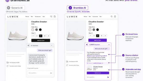
Brand-Consistent AI Chats Build Trust and Conversions
When AI mirrors your brand voice, shoppers relax—questions get answered, carts grow, and support load drops. Learn the playbook to align tone, trust, and ROI.
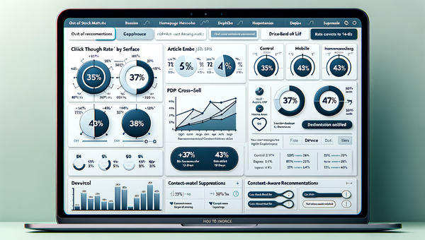
How Context-Aware AI Recommendations Lift CTR
See how context-aware AI recommendations lift CTR by 25–60% with intent signals, page context, and history. Practical steps, KPIs, and implementation tips.
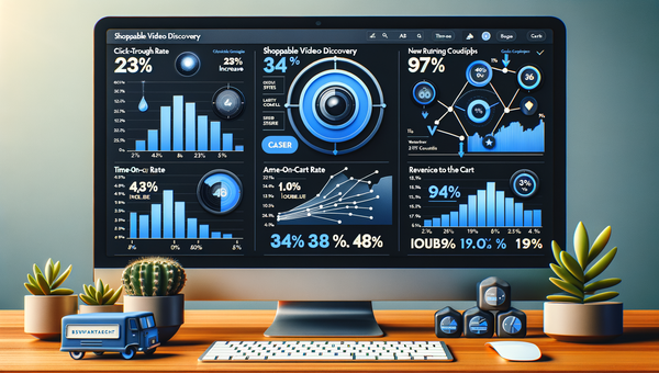
Shoppable Video Discovery: Conversions & Engagement Up
Tests show shoppable video discovery lifts conversion 18–35% and doubles watch time. See the UX patterns, KPIs, and how to deploy it quickly with Brambles.ai.
Explore Brambles.ai
Learn more about our AI-powered agentic commerce platform, agentic shopping, and shopping assistance solutions.
Explore More Insights
Discover more articles on AI, automation, and business innovation
View All Articles