Personalization Without Creepiness: From Lists to Fit
Move beyond 'Best X for Y' lists with privacy-safe guided selling. Design non-creepy personalization that boosts conversions and trust using minimal data.
personalized recommendations Without Creepiness: From Lists to Fit
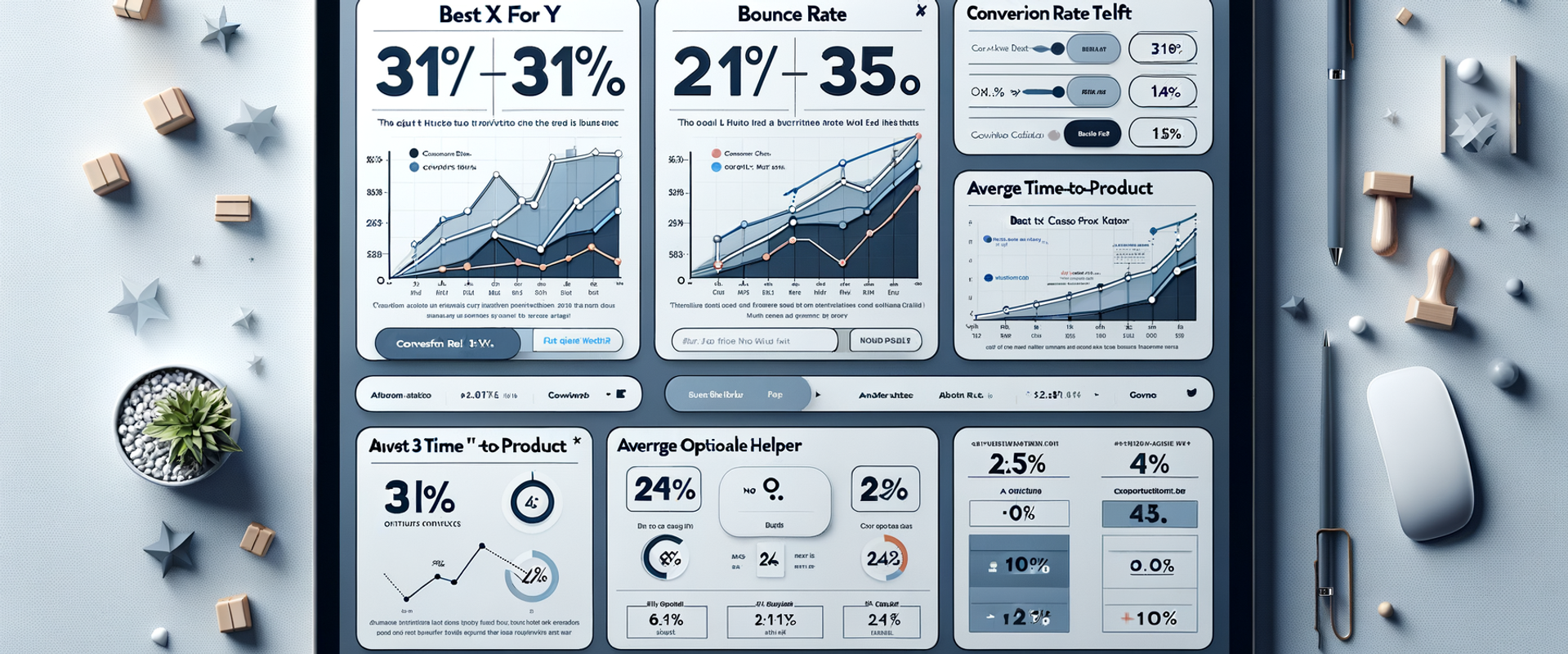
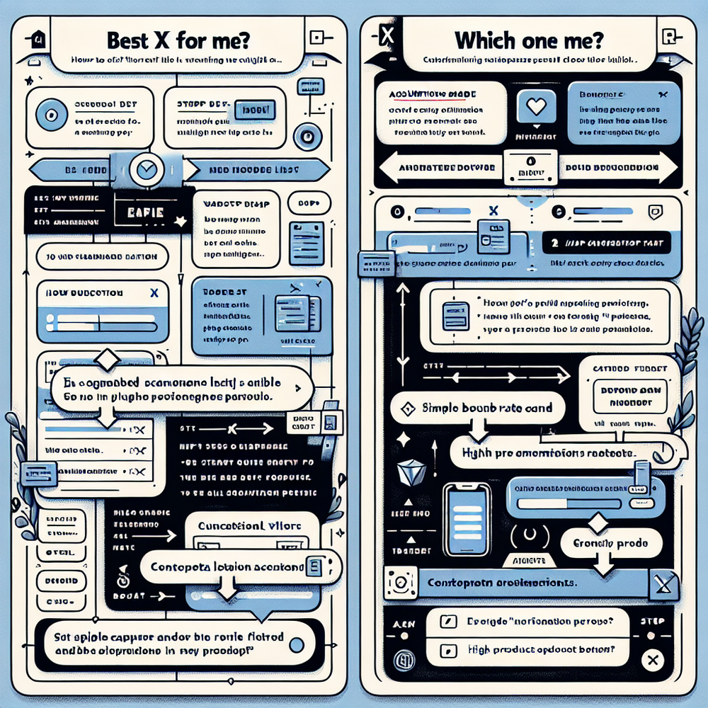
A surprise we didn’t expect: when we replaced a high-traffic “Best webcams for streaming” list with a 45‑second choice helper, conversions rose 31%, and bounce dropped 22%, with zero PII collected. The helper asked only three optional questions (budget range, room lighting, connection type) and explained why each answer mattered. Another test on a 100k‑session apparel category nudged users from a top‑10 list into a “Which fit is right for me?” flow. PDP add‑to‑cart jumped 18% and returns fell 9% month‑over‑month because the flow set better expectations around fabric stretch and care. Small moves. Big trust. No creepiness. If you’re on WordPress, you can implement guided selling and session-based personalization without third-party cookies or PII; you’ll find the relevant tools below.
What’s Broken with “Best X for Y” Lists
Static listicles batch users into large, fuzzy segments: “students,” “gamers,” “home offices.” That’s not intent; that’s a stereotype. These pages over-index on affiliate SEO but under-serve decision-making. Signals that matter—constraints, context, tradeoffs—are pushed below the fold or ignored. Baymard Institute’s product-finding research notes that users struggle when filters don’t map to real goals (e.g., “resolution” vs. “crisp in low light”). We see the same in scroll maps: users skim specs, then pogo-stick back to search. Meanwhile, cookie-based “personalization” tries to chase people around the web. It’s noisy and, post-ATT and third-party cookie deprecation, increasingly blunt. Worse, it feels invasive. Salesforce’s 2024 Connected Customer report shows 73% expect better personalization, yet 61% have walked away over trust concerns. The opportunity is to personalize the decision process itself—what questions we ask and how we explain tradeoffs—without treating the user as a dossier.
How Personalization Works Without Getting Creepy
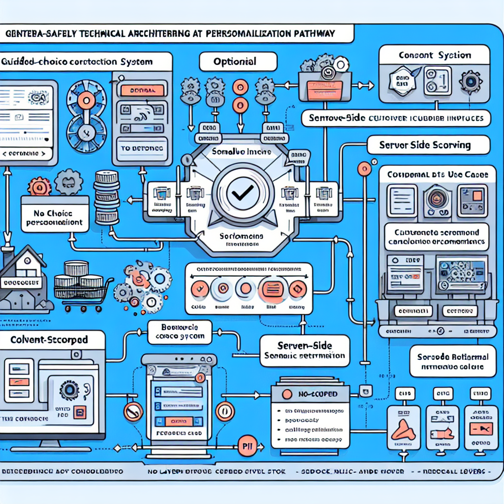
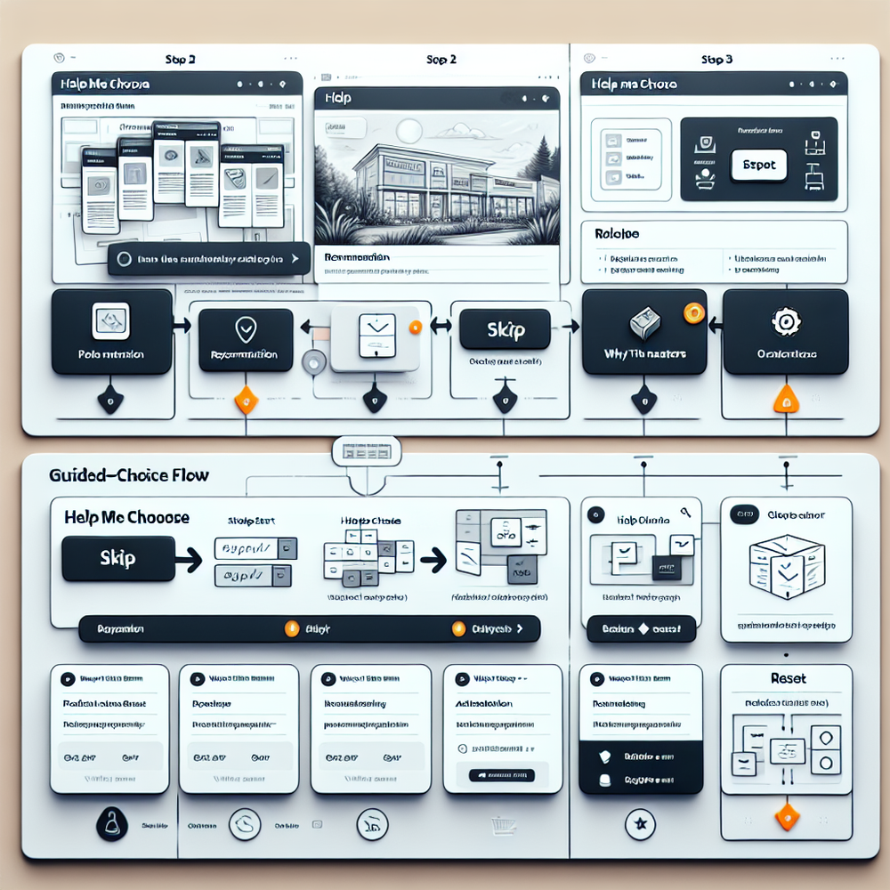
The trust-safe pattern is session-first, purpose-limited, and transparent. Think zero-party and on-page context—not identity. Start by inferring micro-intent from the entry point (query contains “quiet blender at night”), the page module touched (comparison table vs. Q&A), and the first interaction (clicked “noise level”). Then offer a small, skippable helper: “Want help choosing? 45 seconds.” Every question should: (a) map to a real tradeoff, (b) be optional, (c) show why it matters. No names, no emails, no cross-site stitching. Technically, this looks like a session-scoped state machine: each answer adjusts a relevance score across attributes. A transparent recommendation card then explains the rationale—e.g., “You said late-night use; we prioritized <55 dB models.” McKinsey’s Next in Personalization research shows relevance drives loyalty when it’s visibly useful. Add a prominent “reset” and a link to see the full catalog. If you store the answers, keep them ephemeral, tied to purpose, and clearly deleteable. That’s personalization as a service—not surveillance.
Implementation Guide: From Listicles to Choice Helpers
1) Audit intent gaps. Pull top entry queries and on-page searches; list the top 7 tradeoffs real shoppers face. If a filter or spec doesn’t map to a tradeoff, demote it.
2) Draft the helper. Cap at 3–5 short questions. For each, include why it matters: “Lower light means larger sensor.” Add a skip link and a visible reset.
3) Build the rationale card. Always explain the recommendation in plain language: “Because you chose carry-on travel, we prioritized 40L packs under 1.2kg with hip belts.” Include two alternatives with explicit differences.
4) Start session-only. Don’t require login. Store answers in memory or session storage. If you ask for opt-ins (e.g., email for saving results), make it post-recommendation and clearly optional.
5) Instrument everything. Track helper starts, completion rate, time-to-first recommendation, product-match clicks, PDP engagement, and add-to-cart from helper flows.
6) Target placement. Replace the hero of top listicles with the helper, and add it to key category pages.
7) Iterate weekly. Review the top drop-off question, and either rephrase, swap the control, or show an example. Small copy tweaks often beat algorithm tweaks.
If you’re on WordPress, use the Brambles blocks and the Commerce Module to ship this fast.
Measuring ROI, Not Just Clicks
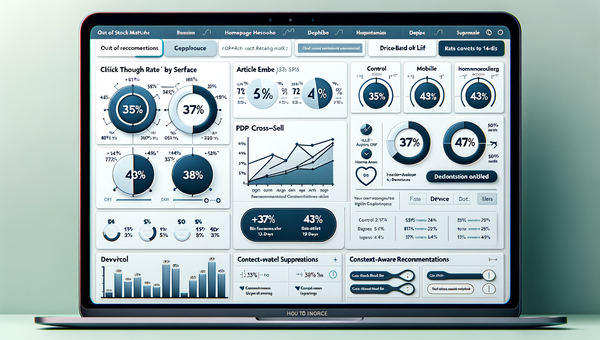
Set targets before you ship. Benchmarks we’ve seen on first releases: 55–70% helper start rate when placed in the hero, 65–85% completion for 3–5 questions, and a 10–25% lift in PDP add-to-cart from helper sessions. Core KPIs: (1) Completion rate = completes / starts. (2) Product match CTR = recommendation clicks / completes. (3) Time to product match (lower is better). (4) PDP engagement depth (scroll to specs, Q&A opens). (5) Purchase conversion and revenue per session specifically from helper flows. (6) Opt-in rate when offered post-recommendation. Attribute incrementality with an A/B split: 50% see the helper by default; 50% see the legacy listicle or a simple comparison grid. Run at least two business cycles and report confidence. For quality, track match satisfaction via a 1–5 micro-survey on the recommendation card. Baymard suggests plain-language specs improve comprehension—mirror that in your rationale copy. One apparel client’s post-purchase survey showed a 14% drop in “item not as described” complaints after we added “Why this fit?” explanations.
First-Party Data, Trust, and Micro-Permissions
Trust starts with purpose and plain English. State why you’re asking a question right next to it: “We ask about lighting to filter low-noise sensors.” That aligns with Google’s UX research on consent fatigue—explode the abstract banner into contextual micro-explanations. Keep answers portable: provide a “Copy my answers” button and a one-click delete. If you want an email to save results, ask after giving the recommendation, and phrase it as a service: “Email me this setup so I can compare later.” Salesforce’s 2024 report notes 80% of customers are more likely to share data when they see clear value. Make your value obvious and immediate. Honor regional consent frameworks (IAB TCF where relevant), and ensure your helper functions without cookies by default. Store only what you must, for as long as you must. A quick rule: if the user would be surprised by your use of their input, don’t do it. That standard is both ethical and effective.
Common Pitfalls We See (and How to Avoid Them)
- Asking for identity first. It’s a trust tax. Deliver value, then invite opt-in.
- Over-long helpers. Past 6 questions, completion craters. Compress or branch conditionally.
- Vague questions. “What’s your budget?” is fine—add ranges and context. “What’s your experience level?” is meaningless without examples.
- Dark patterns. Don’t bury “skip” or make reset hard to find. Users remember friction.
- Black-box recommendations. If you can’t articulate why a product fits, users won’t believe it. Show 2–3 plain-language reasons.
- Catalog mismatches. If the helper promises “quiet,” ensure your data model includes real noise-level attributes. Garbage-in breaks trust.
- Siloed analytics. Instrument at the event level and join with orders. One retailer saw a 23% lift in helper-led CVR but discovered returns spiked in one subcategory; the fix was adding a care instruction hint to the rationale card, which normalized returns the next month.
Edge case worth solving: cold-start traffic from social. Show a pre-question card with two simple entry points (“Silent” vs. “Powerful”) to capture direction before detail.
Future Outlook: Cookieless, Intent-Rich Experiences
The next year looks less like identity graphs and more like on-page semantics plus consented zero-party data. Two trends to watch: (1) contextual LLMs grounded in your catalog and policy rules to generate rationale copy on the fly while staying session-scoped; (2) server-side event pipelines that enrich only with first-party signals (inventory, shipping ETA, sustainability tags) to improve match quality without tracking people across sites. Google’s Privacy Sandbox will keep shrinking cross-site signals; that’s fine if your on-site experience asks better questions and explains answers. Our most durable gains have come from clarity, not cleverness. If you can help a user trade off noise vs. power, stretch vs. structure, or features vs. cost in under a minute, you’ve earned the conversion—and the right to ask for more later. Start with “Which one for me?” and keep the receipts in your analytics.
Tooling notes: WordPress users can add a choice helper via blocks, wire it to their catalog, and ship in days. If you need a starting point or a commerce-ready module, see the links below.
Related posts
View all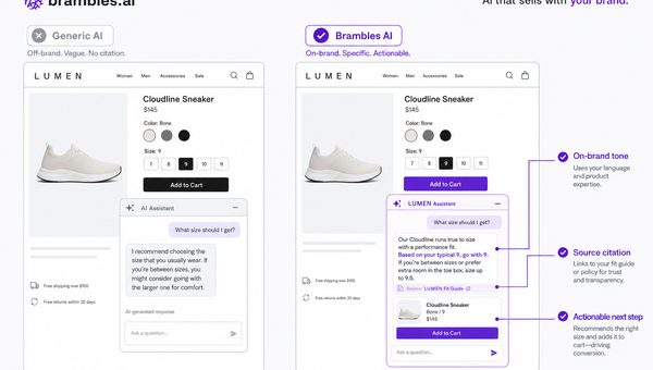
Brand-Consistent AI Chats Build Trust and Conversions
When AI mirrors your brand voice, shoppers relax—questions get answered, carts grow, and support load drops. Learn the playbook to align tone, trust, and ROI.
How Context-Aware AI Recommendations Lift CTR
See how context-aware AI recommendations lift CTR by 25–60% with intent signals, page context, and history. Practical steps, KPIs, and implementation tips.

Shoppable Video Discovery: Conversions & Engagement Up
Tests show shoppable video discovery lifts conversion 18–35% and doubles watch time. See the UX patterns, KPIs, and how to deploy it quickly with Brambles.ai.
Explore Brambles.ai
Learn more about our AI-powered agentic commerce platform, agentic shopping, and shopping assistance solutions.
Explore More Insights
Discover more articles on AI, automation, and business innovation
View All Articles