Branding Your Assistant: Color, Tone, Disclaimers & Voice
A field-tested guide to branding your assistant—dial in color, tone, disclaimers, and author voice matching with step-by-step setups, metrics, and pitfalls to a
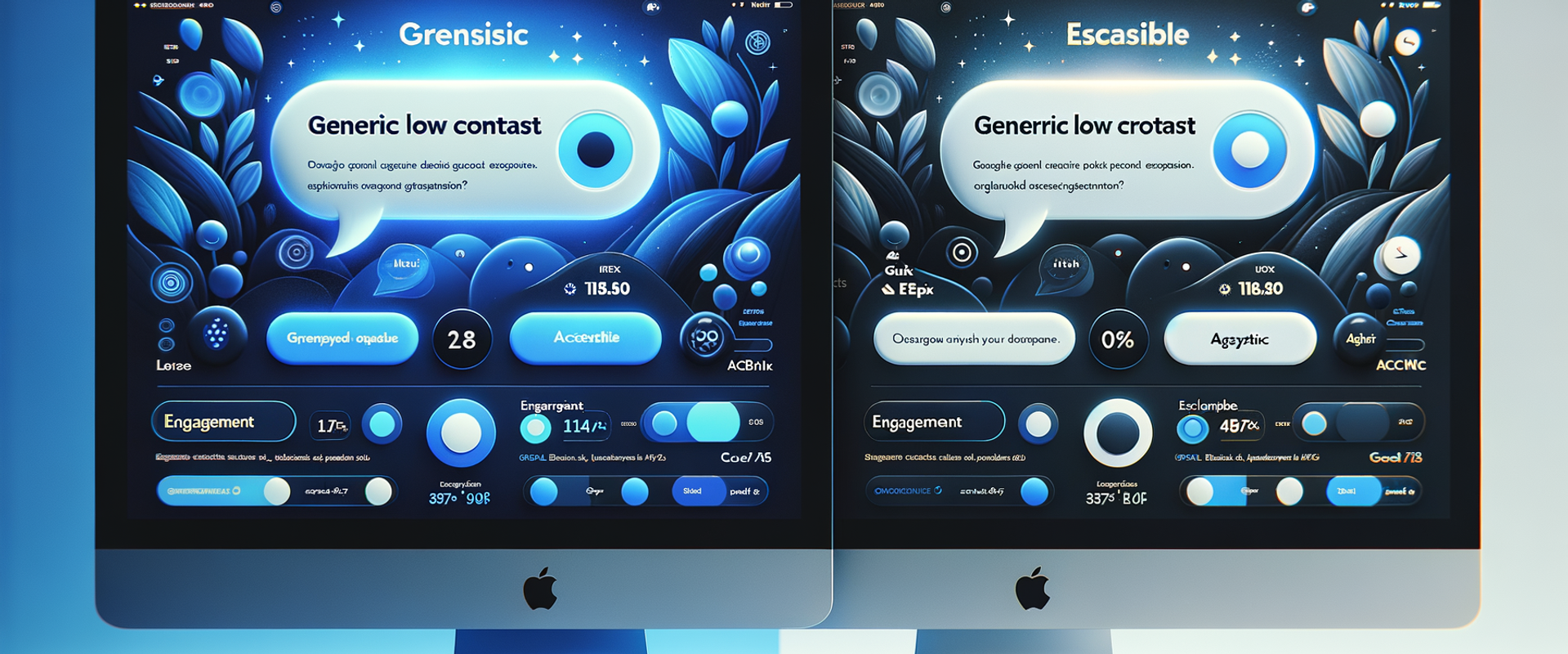
On a consumer electronics store with 140k monthly sessions, we saw the chat assistant’s engagement jump 31% after we swapped its generic blue for the brand’s deep ink (#111827), paired with a warmer tone and a visible “this is guidance, not legal advice” disclaimer above the input. A similar change on a B2B SaaS site cut escalations to customer service by 18% because users finally understood what the assistant could and couldn’t do. Color, tone, and disclosure aren’t cosmetic—together they set expectations, reduce friction, and determine whether people trust the experience. This playbook shows exactly how to brand an assistant across color systems, tone, disclaimers, and author voice matching, with setups you can ship this week and the metrics that prove it.
What’s Broken in Most Assistants
Most assistants ship with a default look and a generic tone—fine for demos, damaging in production. Three issues show up repeatedly: mismatched visual language, fuzzy expectations, and tone drift.
- Visual mismatch: Off-brand colors and low-contrast bubbles make the widget feel bolted-on. Baymard Institute notes that inconsistent UI elements erode trust and increase abandonment, especially when call-to-action treatments vary from the rest of the site.
- Fuzzy expectations: Disclaimers are buried or written in legalese. Users over-trust, get a wrong answer, and blame the brand. Google’s UX research on helpful content stresses up-front scope setting with plain-language qualifications.
- Tone drift: The assistant answers like documentation, while the blog sounds human. Nielsen Norman Group’s tone-of-voice work shows that inconsistent tone lowers perceived credibility and warmth.
Anecdote: On a home goods marketplace, our first pass used default teal and a neutral tone. Sessions with assistant: 9.7%. After aligning colors with their terracotta-accent palette and introducing a “friendly expert” tone, sessions rose to 13.2% and average chat length increased by 24 seconds—enough time to recommend complementary items.
How Branding the Assistant Actually Works
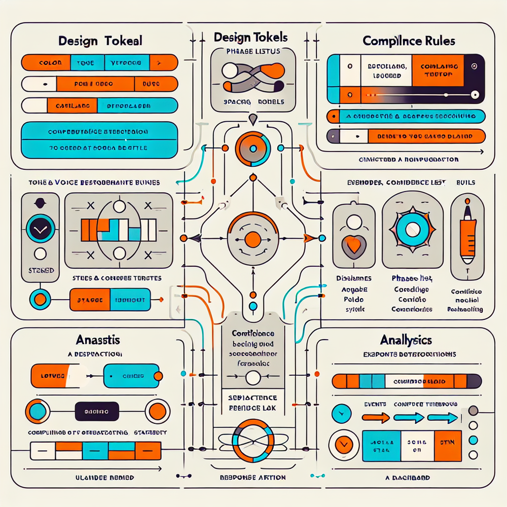
Think of the assistant as another surface in your design system. You’ll define tokens, tone rules, and disclosure patterns, then wire them into the assistant’s UI and behavior.
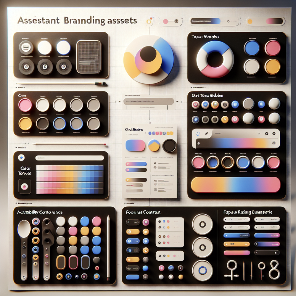
- Color tokens and typography: Create a small token set the assistant can consume: brand-primary, brand-accent, text-default, text-muted, surface-default, surface-elevated, success, warning, danger. Add typographic scale (e.g., 14/20 for body, 12/16 for meta). Include dark mode variants.
- Tone taxonomy: Pick 3–4 sliders (formality, enthusiasm, empathy, brevity) with allowed ranges per context. For product discovery you might use formality: medium, brevity: high; for long-form advice, formality: low-medium, empathy: medium, brevity: medium.
- disclaimers and scope: Define a top-of-chat disclosure (persistent), a first-answer inline qualifier (contextual), and a micro-escalation line when confidence drops. Use plain language per FTC guidance and keep reading level around Grade 7–8.
- Author voice matching: Extract style from your best content—sentence length, idioms to use/avoid, brand phrases, and formatting norms. Use it to set rules: “Prefer concrete verbs, no adverbs in CTAs, contractions allowed, emojis never.”
Architecture-wise, treat these as sources of truth governed in your CMS or design tokens repo. The assistant UI reads tokens; the response layer reads tone and voice rules; the compliance layer injects disclaimers based on intent and confidence. Changes publish atomically so the look and language evolve together.
Implementation Guide: Colors, Tone, Disclaimers, Voice
Step 1: Color tokens and accessibility
- Audit contrast. Aim for at least 4.5:1 text-to-background (WCAG AA). Many assistants use 3:1 by default—too low for body text.
- Define tokens in your system, e.g.
brandPrimary: #111827
brandAccent: #E76F51
textDefault: #111827
textMuted: #6B7280
surfaceDefault: #F9FAFB
surfaceElevated: #FFFFFF
- Apply to: launcher button, header bar, user/message bubbles, quick-reply chips, and error states. Don’t forget focus rings (2–3px, highly visible) and keyboard navigation.
Step 2: Tone sliders and context mapping
- Create a matrix by intent: support, product discovery, billing, editorial. For each, define ranges: formality 1–5, empathy 1–5, brevity 1–5.
- Example: billing = formality 4, empathy 3, brevity 4. Product discovery = formality 2, empathy 4, brevity 3.
Step 3: Disclaimers that inform without scaring
- Top-of-chat (persistent): “I can help with product guidance and troubleshooting. For account or legal issues, I’ll connect you to a human.”
- Inline qualifier (when needed): “Here’s general guidance based on our docs—confirm details with your account manager.”
- Confidence-triggered microcopy (<0.6): “Not fully sure. Want me to open a ticket?”
- Keep it short, plain, and visible. Nielsen Norman Group’s research shows microcopy performs best when placed proximal to the action.
Step 4: Author voice matching
- Build a small corpus: 20–40 of your most representative posts, release notes, and email newsletters.
- Extract patterns: average sentence length, idioms, CTA style, banned phrases. Decide on reading level (Hemingway grade 6–8 works well for most).
- Create a ruleset: “Prefer concrete nouns; avoid ‘leverage’; use contractions; headlines sentence-case; no exclamation marks in support; keep paragraphs under 4 lines.”
- Seed the assistant with 5–10 “golden examples” of on-voice answers.
Step 5: QA and release
- A/B test visuals (launcher color, header contrast) and tone presets by traffic segment. Run at least 7 days to smooth weekday/weekend variance.
- Perform accessibility checks with keyboard-only nav and screen readers.
- Write escalation paths and train agents on the assistant’s boundaries so handoffs feel seamless.
Measuring ROI and the KPIs That Matter
Treat branding changes like product changes: instrument and hold them accountable.
Core KPIs
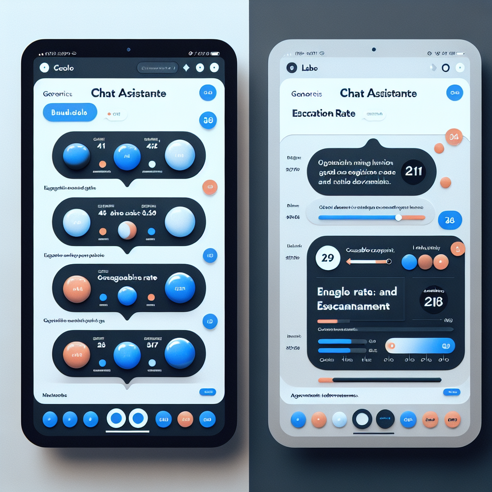
- Engagement rate: percent of sessions that open the assistant. Branding often boosts perceived relevance; we’ve seen lifts from 9–14% on mid-market stores.
- Conversation depth: median messages per session. More isn’t always better—pair with satisfaction.
- Escalation rate: percent of sessions that require human handoff. Good branding and clearer scope usually reduce unnecessary escalations.
- CSAT after chat: quick 3-point or 5-point rating. Keep it one tap.
- Conversion lift: downstream adds-to-cart or trial starts after assistant interaction.
Methodology
- A/B test one layer at a time: color first, then tone, then disclaimers. Maintain consistent traffic allocation. McKinsey’s personalization research shows incremental, layered changes outperform single “big-bang” rebrands.
- Attribute correctly: set a “chat-assisted” dimension and compare against non-chat sessions with matched landing pages.
Two snapshots from the field:
- Apparel DTC, 100k sessions/month: matching the assistant to the brand’s charcoal+rose palette and switching to a “calm guide” tone bumped engagement 42% and improved size selection accuracy by 17% (fewer returns).
- B2B analytics, 60k sessions/month: adding a top-of-chat scope disclaimer cut legal-ticket escalations by 26% and raised post-chat trust scores (from 3.7 to 4.2/5).
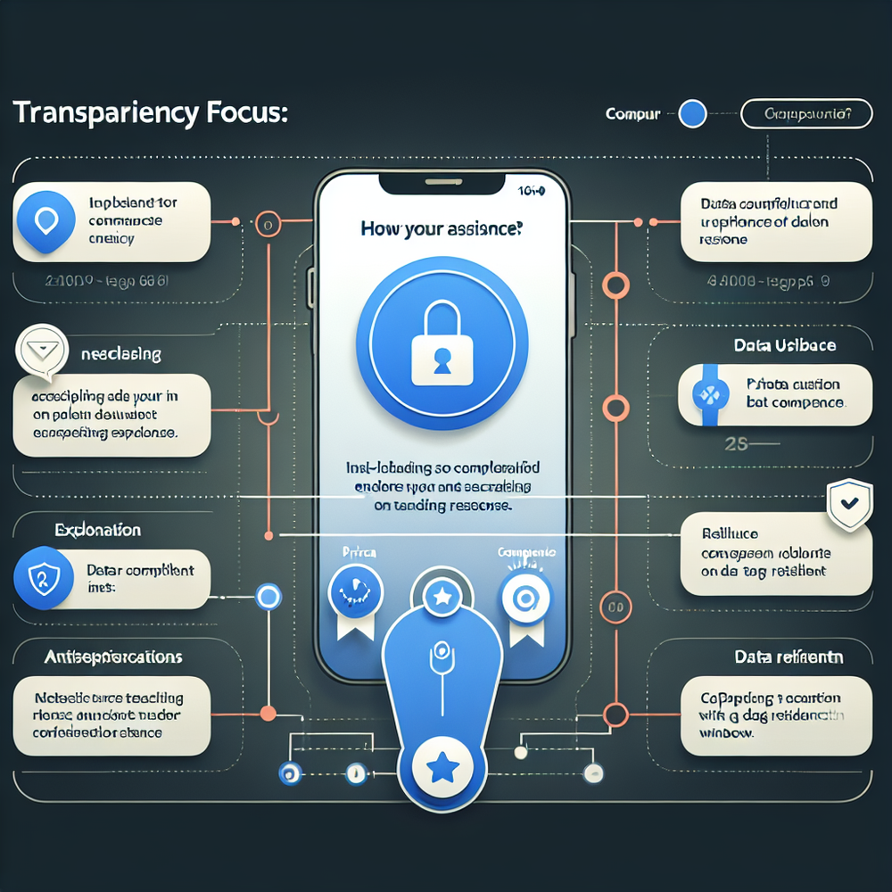
First‑Party Data, Transparency, and Trust
Branding extends to how you explain data use. Users tolerate assistants that are helpful and honest about scope and data. Edelman’s Trust Barometer repeatedly shows that clarity and competence drive trust more than perfection.
Make transparency tangible
- Up-front disclosure of data use: “We use your chat to improve support; no sales outreach without consent.” Keep it contextual rather than burying it in a policy page. Align with GDPR/CCPA obligations and reference your DPA in-line when appropriate.
- Consent flows that feel native: pre-checked toggles are a bad look. Use explicit opt-ins for marketing follow-ups.
- Retention windows by channel: purge raw transcripts after a fixed period; keep aggregated analytics longer. Document this in your admin.
Design patterns that help
- Inline confidence indicators (“Likely” vs. “Unsure”) reduce over-reliance on low-certainty answers. Google UX Research notes that calibrated trust beats blanket warnings.
- Safe handoff microcopy (“Want me to pass this to Maya on support?”) gives users control.
Governance
- Maintain a change log for disclaimers and tone rules. In regulated categories, legal should version and approve. Keep phrasing at a Grade 7–8 level; the FTC favors clear-and-conspicuous disclosures over fine print.
- Run quarterly audits: transcript sampling for tone adherence, accuracy, and data minimization.
Common Pitfalls and How to Avoid Them
- Legalese overload: A dense disclaimer at the bottom of the window won’t be read. Use a short, plain top-line plus contextual qualifiers. Test comprehension with a 5-second usability test.
- Low contrast and tiny type: If your chat bubble text falls under 4.5:1 contrast or uses 12px body, expect drop-offs. Accessibility is brand.
- Tone whiplash: Mixing chipper marketing lines with stern support replies feels untrustworthy. Map tones by intent and enforce via rules.
- Overfitting to one author: “Voice matching” doesn’t mean imitating a single writer. Build a composite voice from multiple samples and codify rules that outlast personnel changes.
- Ignoring dark mode: Unmapped tokens will invert poorly. Define dark tokens explicitly, then snapshot-test components.
- Static disclaimers: As intents expand (billing, medical, legal), your disclosures must expand too. Keep a playbook of approved variants.
- No sunset plan: Rebrands, seasonal campaigns, and localization require updates. Add a quarterly review to your roadmap.
Quick win checklist
- Tokens published in your design system with AA contrast.
- Tone matrix per intent with example snippets.
- Two-tier disclaimers (top-of-chat + inline) in plain language.
- Voice rules + 10 golden answer examples stored in CMS.
- A/B plan with KPIs and a one-week minimum runtime.
- Accessibility audit passed (keyboard, screen reader, focus states).
Related posts
View all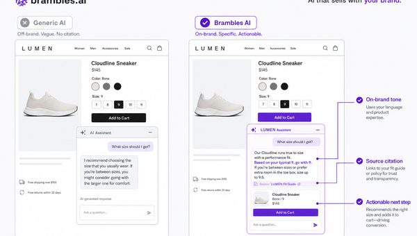
Brand-Consistent AI Chats Build Trust and Conversions
When AI mirrors your brand voice, shoppers relax—questions get answered, carts grow, and support load drops. Learn the playbook to align tone, trust, and ROI.
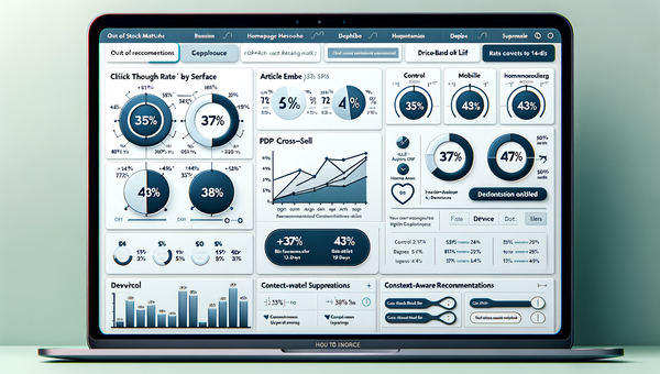
How Context-Aware AI Recommendations Lift CTR
See how context-aware AI recommendations lift CTR by 25–60% with intent signals, page context, and history. Practical steps, KPIs, and implementation tips.
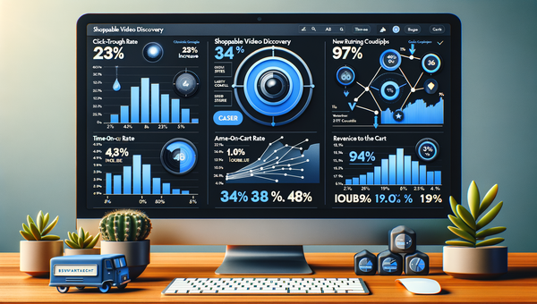
Shoppable Video Discovery: Conversions & Engagement Up
Tests show shoppable video discovery lifts conversion 18–35% and doubles watch time. See the UX patterns, KPIs, and how to deploy it quickly with Brambles.ai.
Explore Brambles.ai
Learn more about our AI-powered agentic commerce platform, agentic shopping, and shopping assistance solutions.
Explore More Insights
Discover more articles on AI, automation, and business innovation
View All Articles